(National tourism campaign for Waitaki)

01. CONTEXT
Tourism Waitaki needed a national campaign to attract new visitors to the region. Waitaki has genuine heritage, landscapes, and local culture, but the challenge wasn't a lack of things to see. It was standing out in a category where every regional tourism board looked the same.
Most competitors used the same formula: a nice photo, some descriptive copy. It worked, but it didn't differentiate.
This created an opportunity to find something more authentic, an idea rooted in the region itself, not just decorated to look appealing.
02. MY ROLE
I was the sole designer at Tourism Waitaki, working within a small cross-functional team: marketing set the campaign objectives, our content lead shaped the messaging, and our General Manager managed approvals and the relationship with external stakeholders, including the rights holder for the campaign name. I owned the concept, the visual identity, and coordinated production across every format.
03. THE OPPORTUNITY
Competitive benchmarking showed a clear pattern. Nearly every regional tourism campaign in the country used the same approach: a nice photo with descriptive text. If Waitaki did the same, it would blend in rather than stand out.
Oamaru's Victorian heritage was a genuine point of difference, but applying a vintage look on top of a generic campaign wasn't enough. The goal was to find something already meaningful to people, not something we'd have to convince them to care about.
04. RESEARCH AND VERIFICATION
Before developing the visual identity, I spent time walking through Ōamaru's Victorian Precinct to understand what made the place visually distinctive. I noticed recurring colours and details across the architecture and historic storefronts: warm limestone, deep maroon, and muted green. These became the first visual references for the campaign.
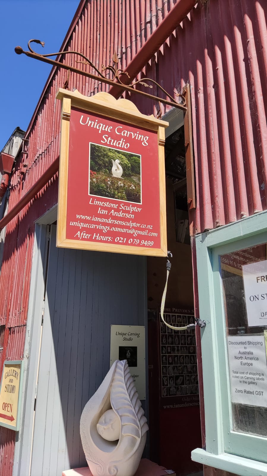

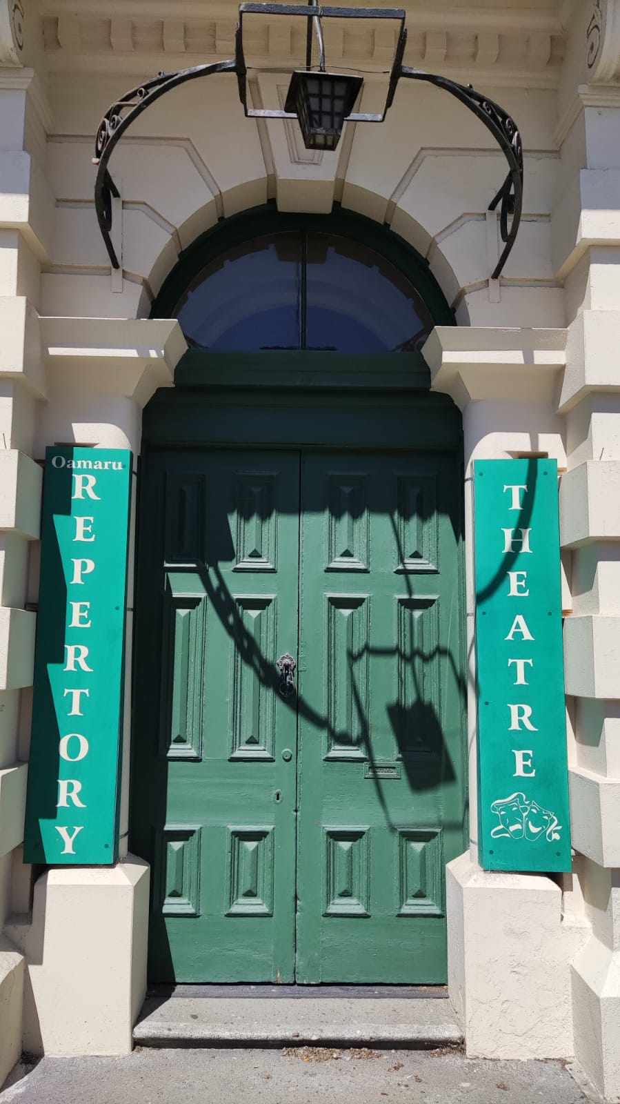


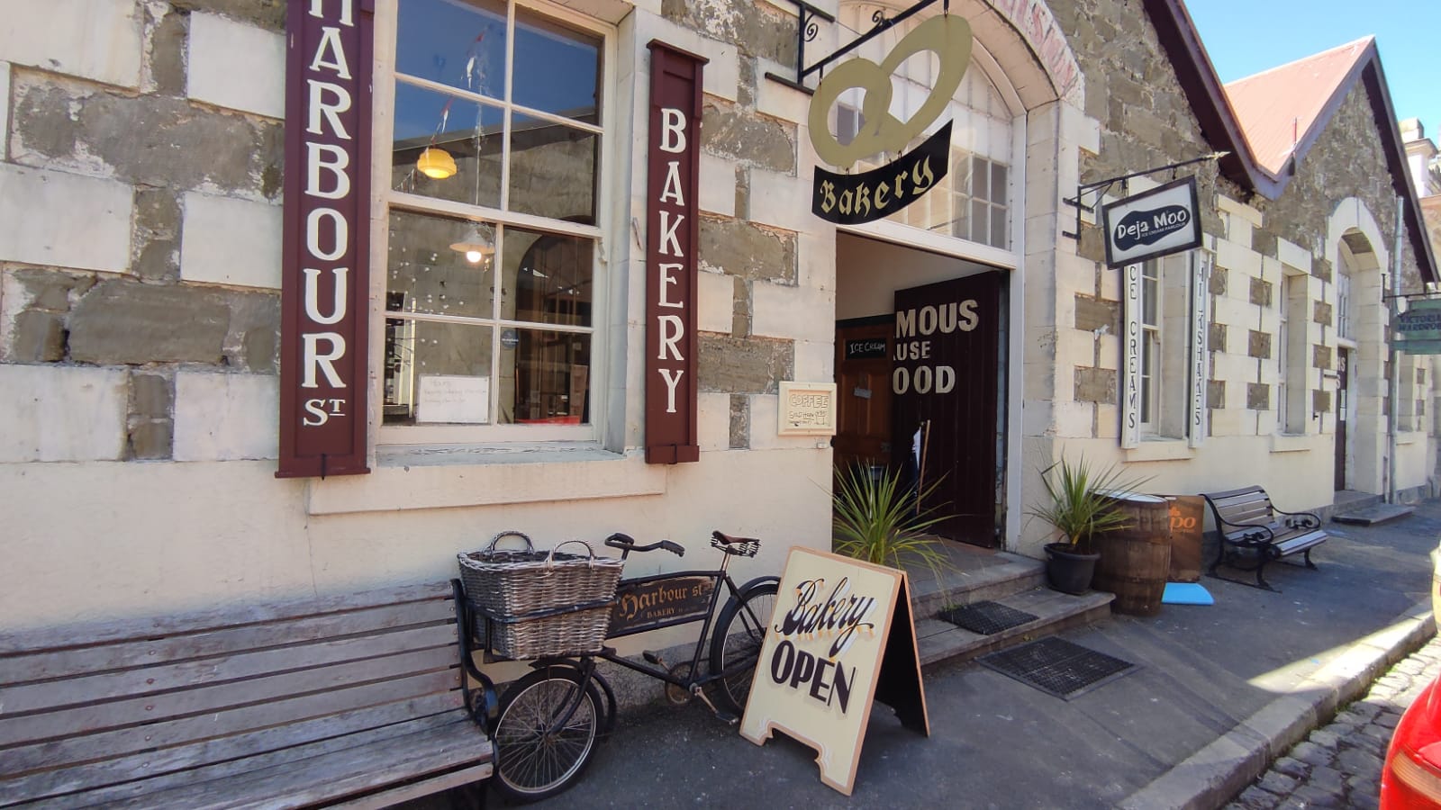
Visual references observed across the Victorian Precinct
While exploring the precinct, I noticed a mural that had been part of the streetscape for decades: "It's Famous because It's Good." Visitors regularly stopped to photograph it, making the phrase more than an old piece of signage — it had become a recognisable part of the visitor experience.

The original mural in Ōamaru's Victorian Precinct
Before adopting the phrase as the campaign name, I researched where it came from. It was originally used as the slogan for Lane's Emulsion, a locally produced tonic dating back to 1898. What initially looked like a piece of historic signage turned out to have a much deeper connection to the region's commercial history.
1898
Tonic invented, slogan painted
1971
Right acquired by local company
1984
Tonic production ends
2023
Origen verified, reused as campaign
The historical connection made the phrase a strong candidate for the campaign, but using an existing phrase also raised a practical question: did we have the right to use it?
I flagged the issue with our General Manager, who contacted the rights holder directly. Permission was granted to use the phrase as the campaign name.
05. VISUAL IDENTITY
With the concept validated, I translated the visual character observed across the Victorian Precinct into a flexible campaign identity. The system combined period-inspired typography, a palette drawn from the architecture and original mural, and a consistent photographic treatment across every touchpoint.
Two directions were on the table.
The first was to lean on Oamaru's Victorian heritage purely as an aesthetic, a vintage look applied over a fairly conventional campaign. It would have looked distinctive, but it risked being decoration rather than substance.
The second was to find something the region's own history had already produced, and use that as the foundation instead of designing around it. The mural offered exactly that: a phrase already recognised and embraced by the audience, not something invented to look authentic.
That's the direction chosen. Rather than creating a new tagline, the decision was to let the region's own history lead the identity.
❌
Heritage as aesthetic
A vintage look applied over a fairly conventional campaign. Distinctive, but closer to decoration than substance.
✅
Heritage as substance
An existing local phrase, already recognised and embraced by the audience. Authentic by nature, not by design.
The campaign needed to feel rooted in Oamaru's history without becoming a heritage museum brand. Morriston Personal gave us that period character through its ornamental serifs, while remaining distinctive enough to work across modern advertising formats, from posters to social media.


The palette began with three recurring visual references found throughout the Victorian Precinct: warm limestone, deep maroon, and muted green. These formed the visual foundation of the campaign identity, while blue, mustard, and coral were introduced as supporting colours to give the system flexibility across different applications and imagery. Rather than relying on one fixed combination, the palette was designed to flex while maintaining a consistent nostalgic character.

A custom vintage filter was applied across all photography to reinforce authenticity and emotional connection with the region's history.


The identity was documented into a simple set of guidelines covering typography, colour, and logo usage. This gave the wider team a clear visual framework while allowing the colour palette to flex across different applications.

06. PROCESS AND DELIVERY
The campaign was developed over a four week period, ahead of a spring launch. Beyond the creative work, this meant coordinating original files with multiple media outlets in time for publication, alongside managing the print production of posters, flyers, and signage.
I used Trello to track every deliverable by format and deadline, keeping the campaign on schedule across print, digital, and outdoor formats.

07. FINAL CAMPAIGN
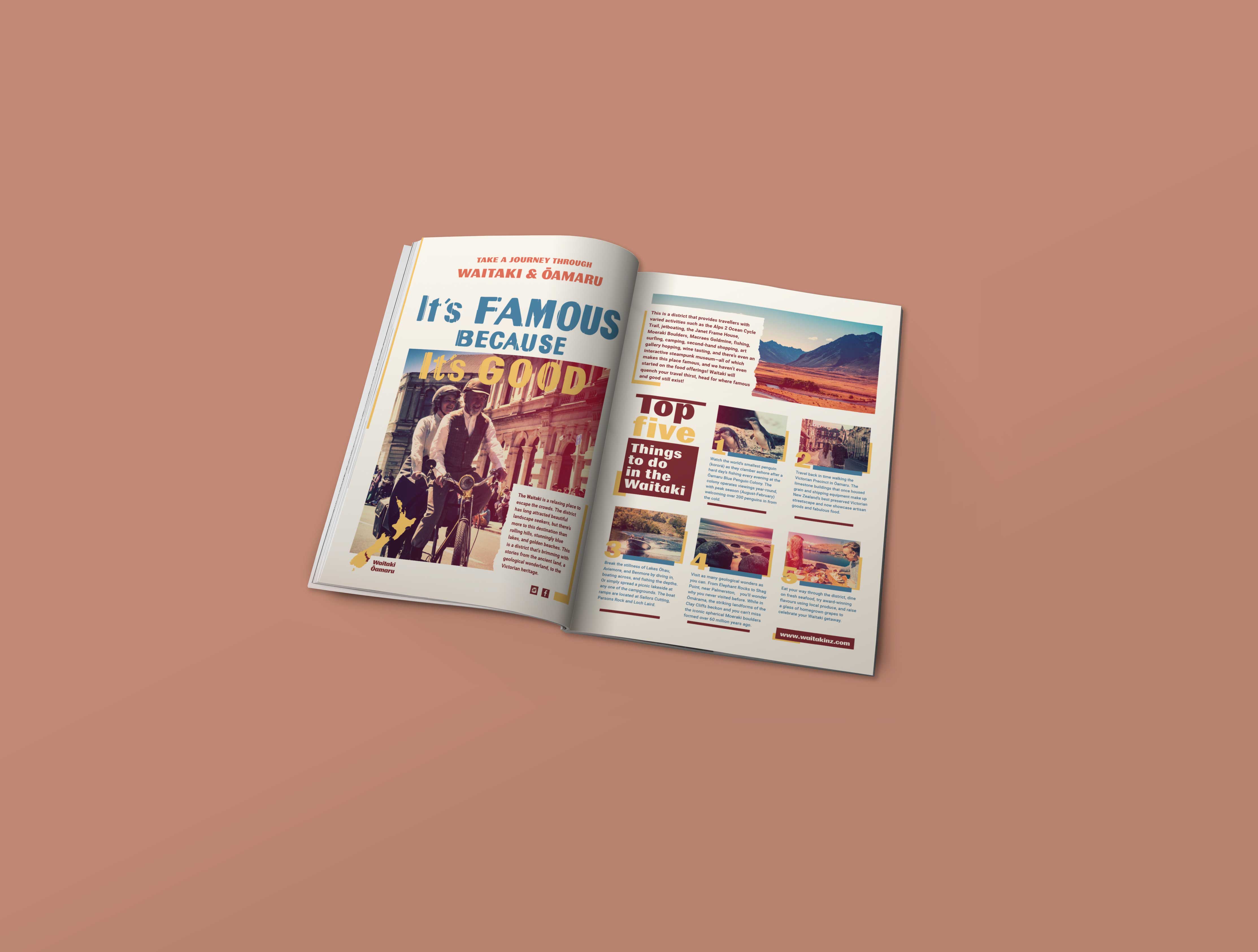
The final campaign brought together the concept and visual identity across a full multi channel rollout: print and digital magazine ads, website banners, posters, outdoor signage, radio, and promotional video, all keeping the same nostalgic, authentic feeling.


08. IMPACT
Campaign Scale
The campaign ran for a full spring season across a national, multi channel rollout: print and digital magazine ads, radio, website banners, outdoor signage, promotional video, and social media, coordinated across multiple media outlets and print vendors within a four week production window.
Strategic impact
Beyond its scale, the campaign gave Waitaki a distinctive creative platform rooted in the region's own history rather than a generic tourism formula. It created a reusable visual identity the organisation could apply across future communications, and connected tourism marketing directly to local heritage in a way that differentiated Waitaki from the conventional tourism campaigns we benchmarked.
09. REFLECTION
The biggest lesson from this project was that a strong creative concept doesn't always come from inventing something new. Sometimes it comes from recognising what's already meaningful to people, and having the judgment, and the diligence, to use it responsibly.
Verifying the phrase's history before using it wasn't just a legal formality. It was part of respecting the region's own story, and making sure the campaign felt authentic rather than borrowed.