eCommerce · UI Design · CRO
From a basic setup to a growth engine
From a basic setup to a growth engine
(+125% Revenue Growth)

How design decisions focused on clarity and conversion helped transform Huntech's eCommerce into a more efficient experience.
How design decisions focused on clarity and conversion helped transform Huntech's eCommerce into a more efficient experience.
01. CONTEXT
A strong brand, an eCommerce that couldn't keep up
Huntech is a New Zealand outdoor retailer specialising in technical hunting gear and equipment.
However, its eCommerce experience was no longer keeping up with the needs of the business.
The platform had several limitations that affected the shopping experience. With a large product catalogue, technical product information, and extended sizing up to 5XL, users needed more clarity when finding, comparing, and choosing products.
This created a clear opportunity to improve the digital experience and better support the business.
01. CONTEXT
A strong brand, an eCommerce that couldn't keep up
Huntech is a New Zealand outdoor retailer specialising in technical hunting gear and equipment.
However, its eCommerce experience was no longer keeping up with the needs of the business.
The platform had several limitations that affected the shopping experience. With a large product catalogue, technical product information, and extended sizing up to 5XL, users needed more clarity when finding, comparing, and choosing products.
This created a clear opportunity to improve the digital experience and better support the business.
01. CONTEXT
A strong brand, an eCommerce that couldn't keep up
Huntech is a New Zealand outdoor retailer specialising in technical hunting gear and equipment.
However, its eCommerce experience was no longer keeping up with the needs of the business.
The platform had several limitations that affected the shopping experience. With a large product catalogue, technical product information, and extended sizing up to 5XL, users needed more clarity when finding, comparing, and choosing products.
This created a clear opportunity to improve the digital experience and better support the business.
02. MY ROLE
Turning Insights into UI Solutions
Turning Insights into UI Solutions
My role was to lead the UI redesign, working within a multidisciplinary team under our Design Lead.
I was responsible for identifying key usability issues, translating findings into practical UI solutions, contributing to the Design System, and preparing designs for developer handoff.
03. FOCUS AND OBJECTIVES
Focus on the highest-impact areas
While the heuristic analysis covered the entire website, this case study focuses on the purchase journey, where the biggest opportunities to improve conversion were identified.
03. FOCUS AND OBJECTIVES
Focus on the highest-impact areas
While the heuristic analysis covered the entire website, this case study focuses on the purchase journey, where the biggest opportunities to improve conversion were identified.
03. FOCUS AND OBJECTIVES
Focus on the highest-impact areas
While the heuristic analysis covered the entire website, this case study focuses on the purchase journey, where the biggest opportunities to improve conversion were identified.
Homepage
→
→
→
→
→
Category (PLP) 🔥
→
Product Page (PDP) 🔥
→
Checkout
→
→
04. AUDIT AND DIAGNOSIS
Key findings from the heuristic analysis
I conducted a heuristic analysis of the entire website and reviewed the purchase journey to identify friction points affecting the user experience and business goals.
From all the findings, I prioritised the opportunities with the highest impact on conversion.
04. AUDIT AND DIAGNOSIS
Key findings from the heuristic analysis
I conducted a heuristic analysis of the entire website and reviewed the purchase journey to identify friction points affecting the user experience and business goals.
From all the findings, I prioritised the opportunities with the highest impact on conversion.
04. AUDIT AND DIAGNOSIS
Key findings from the heuristic analysis
I conducted a heuristic analysis of the entire website and reviewed the purchase journey to identify friction points affecting the user experience and business goals.
From all the findings, I prioritised the opportunities with the highest impact on conversion.
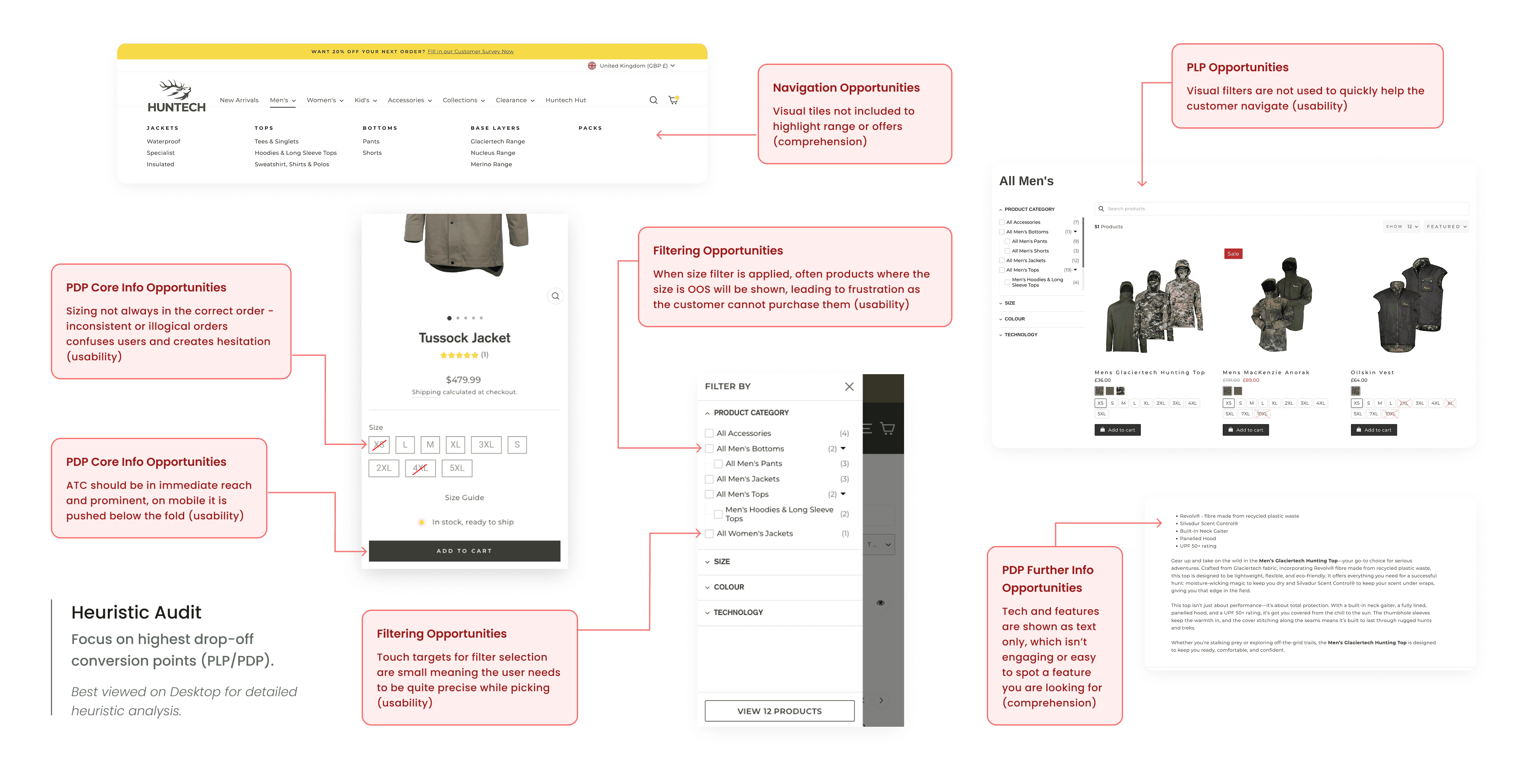
These five had the highest direct impact on conversion:
These five had the highest direct impact on conversion:
01.
Size & Stock
Out-of-stock products remained visible in filters, size selection was inconsistent, and the Size Guide had low visibility in the purchase flow.
02.
Navigation
The mobile navigation lacked a familiar structure, search provided no guidance, and categories relied heavily on text.
03.
Mobile Filtering
Filtering and sorting were separated, the experience required multiple steps, and touch targets were too small on mobile.
04.
Product Information & CTA
Technical benefits were only explained through text, and users could lose the Add to Cart button while scrolling.
05.
Product Merchandising
Users had to open product pages before adding items to the cart, and product cards were inconsistent across the experience.
05. Design Decisions
Five decisions that moved the needle
Each decision translated strategic opportunities into practical UI improvements to support conversion.
1. Product Confidence
2. Product Discovery
3. Mobile Filtering
4. Product Communication
5. Shopping Efficiency
Before
After


Impact: Reduced uncertainty around size and stock helps users make purchase decisions with greater confidence.
05. Design Decisions
Five decisions that moved the needle
Each decision translated strategic opportunities into practical UI improvements to support conversion.
1. Product Confidence
2. Product Discovery
3. Mobile Filtering
4. Product Communication
5. Shopping Efficiency
Before
After
Impact: Reduced uncertainty around size and stock helps users make purchase decisions with greater confidence.
0.5 Design Decisions
Five decisions that moved the needle
1. Size & Stock
2. Product Discovery
3. Filtering
4. Icons & Sticky CTA
5. Shopping Efficiency
Before
After
Impact: Reduced uncertainty around size and stock helps users make purchase decisions with greater confidence.
06. FINAL UI
The final redesigned experience
The final interface brings together the key improvements made across the purchase journey. Every decision was focused on helping users find products faster, understand key information, and make purchase decisions with more confidence.
06. FINAL UI
The final redesigned experience
The final interface brings together the key improvements made across the purchase journey. Every decision was focused on helping users find products faster, understand key information, and make purchase decisions with more confidence.
06. FINAL UI
The final redesigned experience
The final interface brings together the key improvements made across the purchase journey. Every decision was focused on helping users find products faster, understand key information, and make purchase decisions with more confidence.

07. DESIGN SYSTEM
From design system foundations to a tailored experience
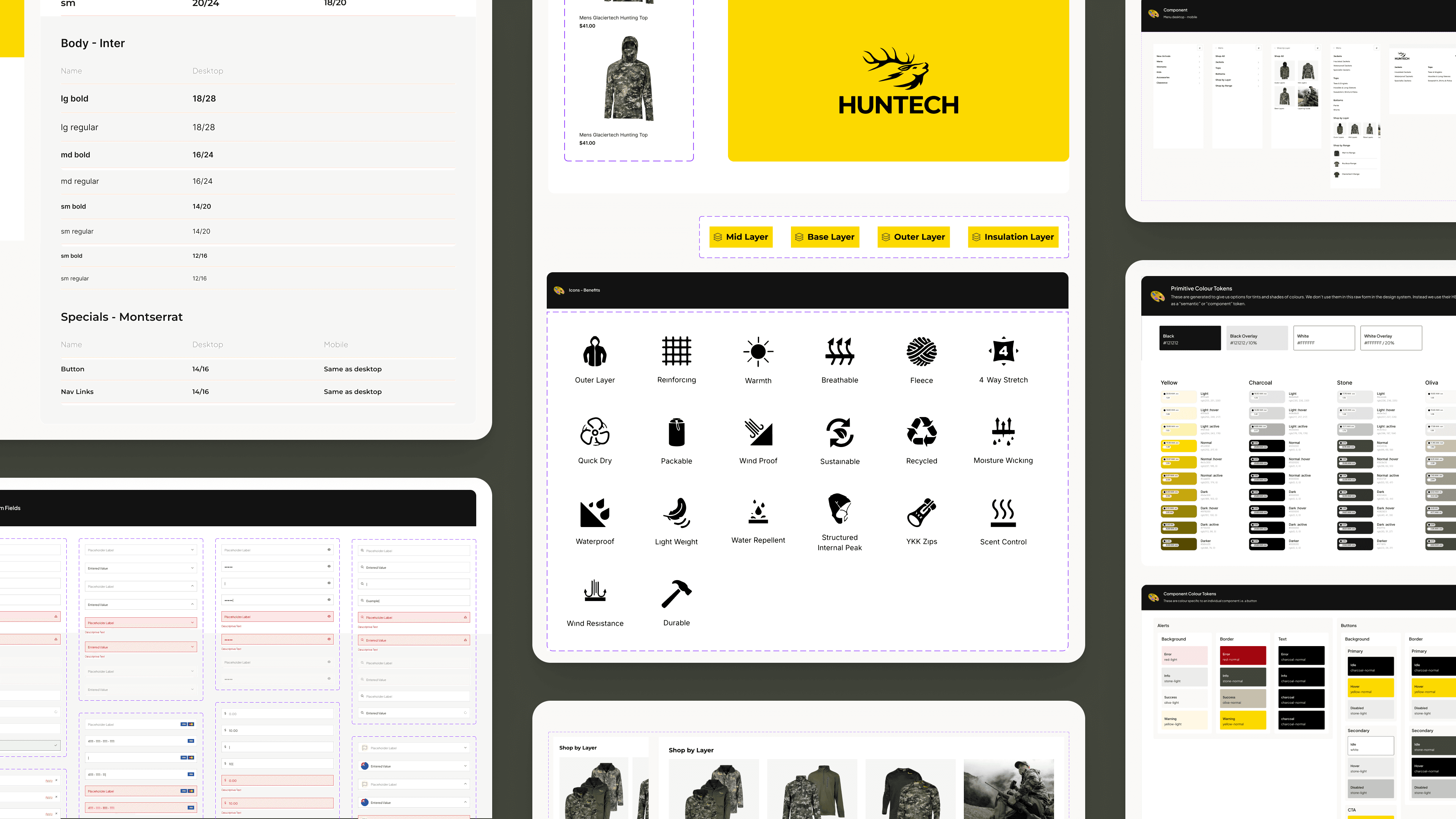
Starting from an existing design system foundation, I adapted components to Huntech's specific needs, added new components, improved existing ones, and ensured consistency across the purchase experience.
The final designs were prepared in Figma for developer handoff, helping ensure a smooth implementation.
07. DESIGN SYSTEM
From design system foundations to a tailored experience
Starting from an existing design system foundation, I adapted components to Huntech's specific needs, added new components, improved existing ones, and ensured consistency across the purchase experience.
The final designs were prepared in Figma for developer handoff, helping ensure a smooth implementation.
07. DESIGN SYSTEM
From design system foundations to a tailored experience
Starting from an existing design system foundation, I adapted components to Huntech's specific needs, added new components, improved existing ones, and ensured consistency across the purchase experience.
The final designs were prepared in Figma for developer handoff, helping ensure a smooth implementation.
08. IMPACT
Results reported by Blackpepper
After launch, the agency reported significant improvements in key business metrics, including revenue growth and Average Order Value (AOV).
While many factors can influence business performance, these results showed that reducing friction can support commercial outcomes.
08. IMPACT
Results reported by Blackpepper
After launch, the agency reported significant improvements in key business metrics, including revenue growth and Average Order Value (AOV).
While many factors can influence business performance, these results showed that reducing friction can support commercial outcomes.
08. IMPACT
Results reported by Blackpepper
After launch, the agency reported significant improvements in key business metrics, including revenue growth and Average Order Value (AOV).
While many factors can influence business performance, these results showed that reducing friction can support commercial outcomes.

+
125%
Revenue Growth
A massive year-on-year increase in total sales.
+
41
Increase in AOV
Customers aren't just buying; they are spending more.
Brand Authority
A digital presence that truly reflects the Huntech brand.
+
125%
Revenue Growth
A massive year-on-year increase in total sales.
+
41
Increase in AOV
Customers aren't just buying; they are spending more.
Brand Authority
A digital presence that truly reflects the Huntech brand.
Business metrics reported by Blackpepper. View their full case study here →
09. REFLECTION
Users weren't looking for simplicity, they were looking for certainty.
The biggest lesson from this project was that reducing friction doesn't always mean simplifying the interface. Users needed to know whether their size was available, whether the product was right for them, and whether it was worth the price.
Designing for eCommerce isn't just about organising content. It's about supporting decisions. Often, the best design isn't the cleanest one — it's the one that removes doubt.
09. REFLECTION
Users weren't looking for simplicity, they were looking for certainty.
The biggest lesson from this project was that reducing friction doesn't always mean simplifying the interface. Users needed to know whether their size was available, whether the product was right for them, and whether it was worth the price.
Designing for eCommerce isn't just about organising content. It's about supporting decisions. Often, the best design isn't the cleanest one — it's the one that removes doubt.
09. REFLECTION
Users weren't looking for simplicity, they were looking for certainty.
The biggest lesson from this project was that reducing friction doesn't always mean simplifying the interface. Users needed to know whether their size was available, whether the product was right for them, and whether it was worth the price.
Designing for eCommerce isn't just about organising content. It's about supporting decisions. Often, the best design isn't the cleanest one — it's the one that removes doubt.
Explore the Visual Archive
Strategic design systems and brand identities, from city-scale campaigns to high-fidelity digital interfaces.




Explore the Visual Archive
Strategic design systems and brand identities, from city-scale campaigns to high-fidelity digital interfaces.
Explore the Visual Archive
Strategic design systems and brand identities, from city-scale campaigns to high-fidelity digital interfaces.