eCommerce · UI Design · CRO
From a basic setup to a growth engine
From a basic setup to a growth engine
(+125% Revenue Growth)

How design decisions focused on clarity and conversion helped transform Huntech's eCommerce into a more efficient experience.
How design decisions focused on clarity and conversion helped transform Huntech's eCommerce into a more efficient experience.
01. CONTEXT
A strong brand, an eCommerce that couldn't keep up
Huntech is Australasia's original technical hunting apparel brand with specialised product ranges, proprietary technology, and extended sizing up to 5XL. A catalog with that level of technical complexity demands a digital experience to match.
However, their eCommerce had grown as a quick solution and no longer reflected the level of the business. With multiple product ranges and high size variation, every friction point in the selection process had a direct cost on conversion.
The experience presented friction in navigation, mobile, and decision-making, directly impacting conversion at key moments in the funnel.
01. CONTEXT
A strong brand, an eCommerce that couldn't keep up
Huntech is Australasia's original technical hunting apparel brand with specialised product ranges, proprietary technology, and extended sizing up to 5XL. A catalog with that level of technical complexity demands a digital experience to match.
However, their eCommerce had grown as a quick solution and no longer reflected the level of the business. With multiple product ranges and high size variation, every friction point in the selection process had a direct cost on conversion.
The experience presented friction in navigation, mobile, and decision-making, directly impacting conversion at key moments in the funnel.
01. CONTEXT
A strong brand, an eCommerce that couldn't keep up
Huntech is Australasia's original technical hunting apparel brand with specialised product ranges, proprietary technology, and extended sizing up to 5XL. A catalog with that level of technical complexity demands a digital experience to match.
However, their eCommerce had grown as a quick solution and no longer reflected the level of the business. With multiple product ranges and high size variation, every friction point in the selection process had a direct cost on conversion.
The experience presented friction in navigation, mobile, and decision-making, directly impacting conversion at key moments in the funnel.
02. MY ROLE
Diagnosis and design across teams
Diagnosis and design across teams
I was part of the design team at Blackpepper, collaborating with design, development, and stakeholders.
My core contributions:
My work developed within a multidisciplinary team in collaboration with another designer, development, and stakeholders, under the guidance of the Design Lead who validated each stage. The contributions listed above were my direct responsibility within that structure.
03. FOCUS AND OBJECTIVES
Prioritise where it matters most
The project began with an audit to map friction points across the purchase journey. From those findings, we prioritised the areas with the highest conversion impact — PLP and PDP concentrated the main drop-offs.
03. FOCUS AND OBJECTIVES
Prioritise where it matters most
The project began with an audit to map friction points across the purchase journey. From those findings, we prioritised the areas with the highest conversion impact — PLP and PDP concentrated the main drop-offs.
03. FOCUS AND OBJECTIVES
Prioritise where it matters most
The project began with an audit to map friction points across the purchase journey. From those findings, we prioritised the areas with the highest conversion impact — PLP and PDP concentrated the main drop-offs.
Business
→
→
→
→
→
Category (PLP) 🔥
→
Product Page (PDP) 🔥
→
Checkout
→
→
Three objectives guided every design decision:
🎯 Business Scale revenue by aligning the digital experience with Huntech's brand authority — the site needed to match the quality of the product it sold.
👤 User Enable every person to confirm their size and stock availability before reaching the cart. That was the exact moment where the funnel was losing the most users.
🖥 UI / Strategic Mobile-First system with an optimised Thumb Zone. Technical product advantages as visual protagonists — not buried in text nobody reads.
04. AUDIT AND DIAGNOSIS
Analysis focused on the highest-impact points
I conducted a full heuristic analysis of the site organised by Usability, Comprehension, Trust, and Motivation. From all the findings, I filtered those with direct impact on the project's design decisions.
04. AUDIT AND DIAGNOSIS
Analysis focused on the highest-impact points
I conducted a full heuristic analysis of the site organised by Usability, Comprehension, Trust, and Motivation. From all the findings, I filtered those with direct impact on the project's design decisions.
04. AUDIT AND DIAGNOSIS
Analysis focused on the highest-impact points
I conducted a full heuristic analysis of the site organised by Usability, Comprehension, Trust, and Motivation. From all the findings, I filtered those with direct impact on the project's design decisions.
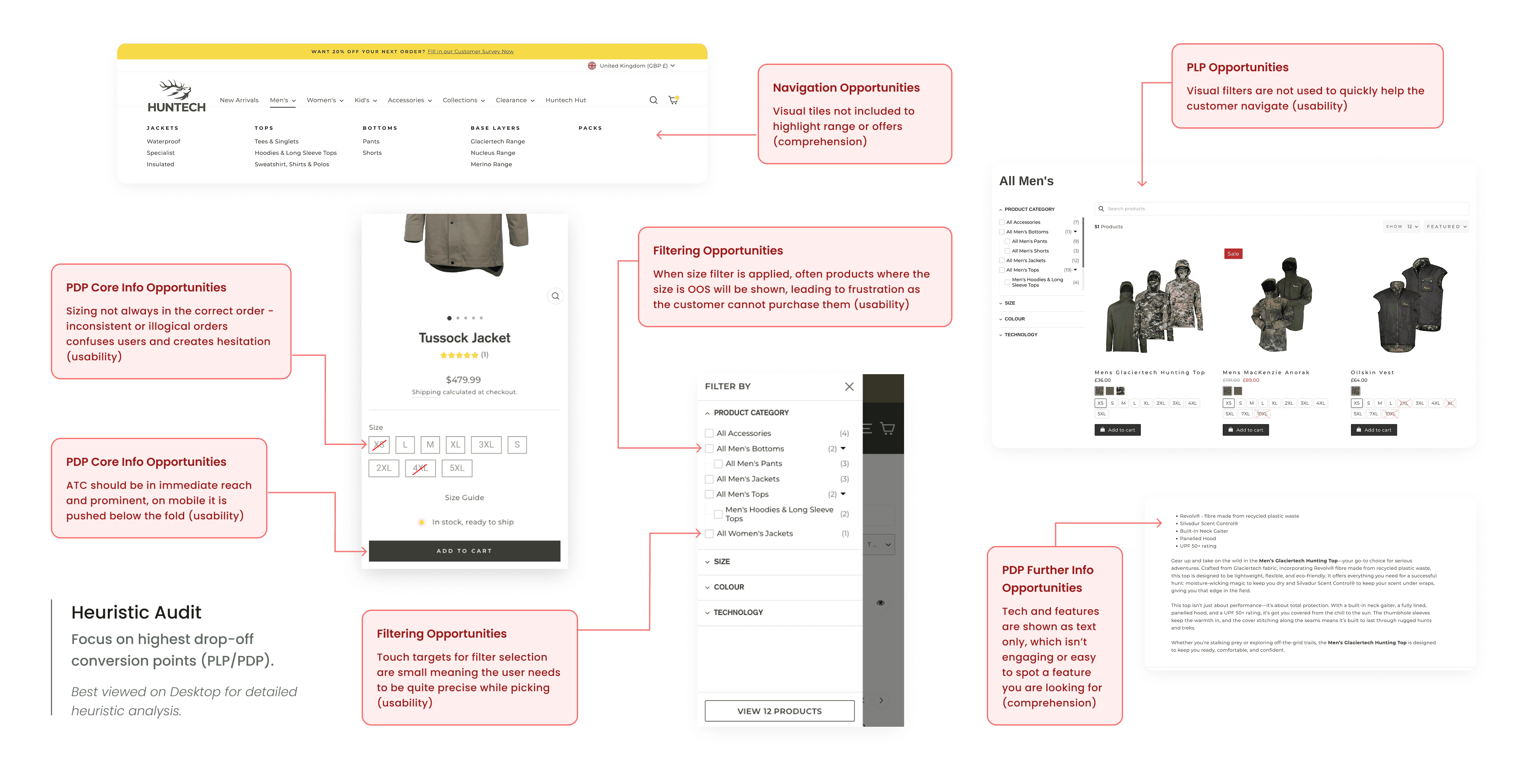
Key findings:
Out-of-stock products visible in filters
Inconsistent size order
Small touch targets (mobile)
CTA out of reach on scroll
Low visibility of product benefits
These five had the highest direct impact on conversion:
Key findings:
Out-of-stock products visible in filters
Inconsistent size order
Small touch targets (mobile)
CTA out of reach on scroll
Low visibility of product benefits
These five had the highest direct impact on conversion:
05. DESIGN EXPLORATION
Evaluate before deciding
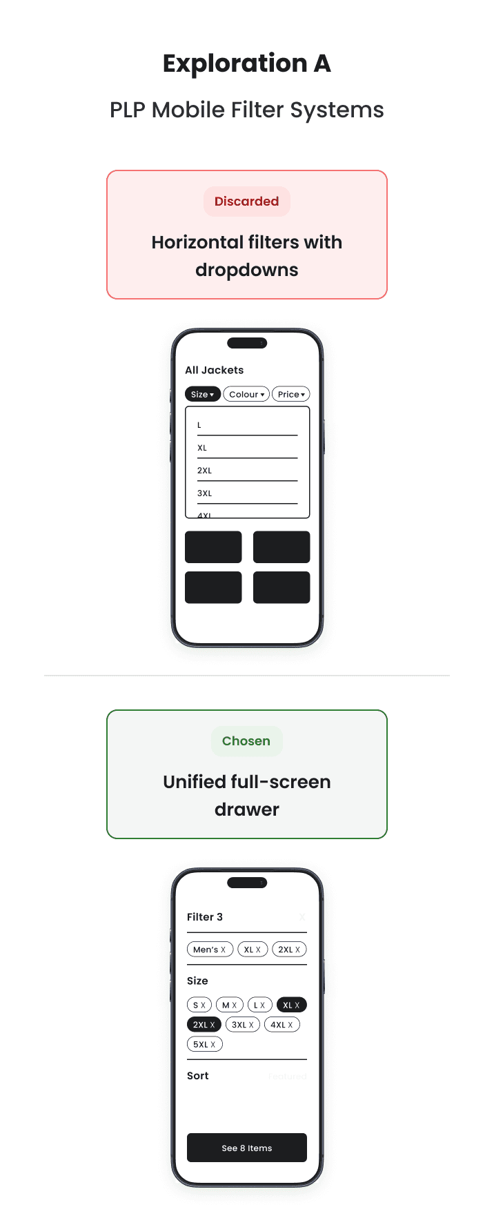
Before defining the final solutions, I evaluated different UI patterns to address the main issues identified.
05. DESIGN EXPLORATION
Evaluate before deciding
Before defining the final solutions, I evaluated different UI patterns to address the main issues identified.
05. DESIGN EXPLORATION
Evaluate before deciding
Before defining the final solutions, I evaluated different UI patterns to address the main issues identified.


05. Design Decisions
Five decisions that moved the needle
Each decision translated strategic opportunities into practical UI improvements to support conversion.
1. Product Confidence
2. Product Discovery
3. Mobile Filtering
4. Product Communication
5. Shopping Efficiency
Before
After


Impact: Reduced uncertainty around size and stock helps users make purchase decisions with greater confidence.
05. Design Decisions
Five decisions that moved the needle
Each decision translated strategic opportunities into practical UI improvements to support conversion.
1. Product Confidence
2. Product Discovery
3. Mobile Filtering
4. Product Communication
5. Shopping Efficiency
Before
After
Impact: Reduced uncertainty around size and stock helps users make purchase decisions with greater confidence.
0.5 Design Decisions
Five decisions that moved the needle
1. Size & Stock
2. Product Discovery
3. Filtering
4. Icons & Sticky CTA
5. Shopping Efficiency
Before
After
Impact: Reduced uncertainty around size and stock helps users make purchase decisions with greater confidence.
07. FINAL UI
The interface that supports every step
The final interface prioritises clarity, consistency, and speed across the entire purchase journey. Every improvement was focused on making key user decisions visible at each stage.
07. FINAL UI
The interface that supports every step
The final interface prioritises clarity, consistency, and speed across the entire purchase journey. Every improvement was focused on making key user decisions visible at each stage.
07. FINAL UI
The interface that supports every step
The final interface prioritises clarity, consistency, and speed across the entire purchase journey. Every improvement was focused on making key user decisions visible at each stage.

08. DESIGN SYSTEM
From core library to brand-specific assets
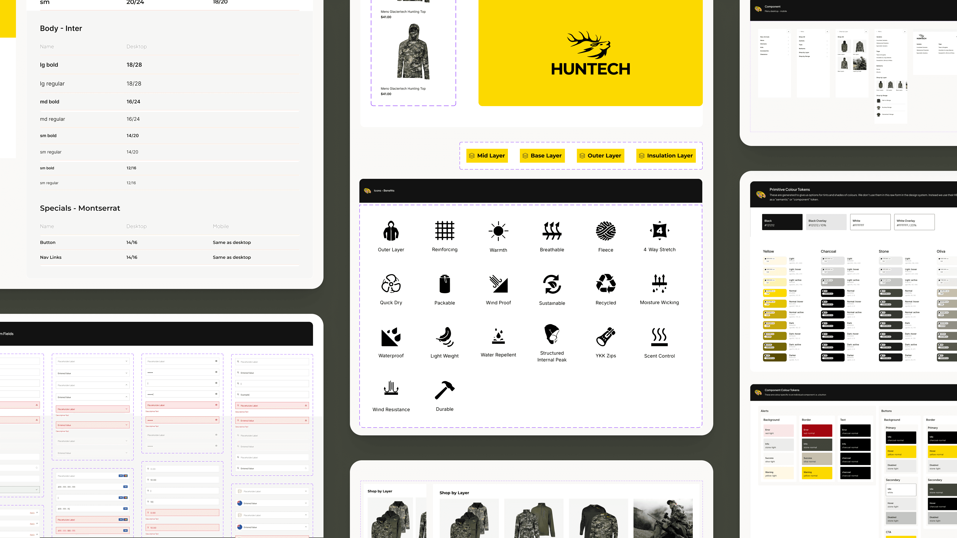
Built on Blackpepper's Core Design System, adapted to Huntech's specific needs. I created new components, extended existing patterns, and ensured consistency across the entire ecosystem.
Delivered in Figma ready for production — pixel-perfect implementation in Shopify with zero technical debt.
08. DESIGN SYSTEM
From core library to brand-specific assets
Built on Blackpepper's Core Design System, adapted to Huntech's specific needs. I created new components, extended existing patterns, and ensured consistency across the entire ecosystem.
Delivered in Figma ready for production — pixel-perfect implementation in Shopify with zero technical debt.
08. DESIGN SYSTEM
From core library to brand-specific assets
Built on Blackpepper's Core Design System, adapted to Huntech's specific needs. I created new components, extended existing patterns, and ensured consistency across the entire ecosystem.
Delivered in Figma ready for production — pixel-perfect implementation in Shopify with zero technical debt.
09. IMPACT
Results reported by Blackpepper
Key performance indicators verified post-launch, demonstrating significant growth in digital revenue and user conversion.
09. IMPACT
Results reported by Blackpepper
Key performance indicators verified post-launch, demonstrating significant growth in digital revenue and user conversion.
09. IMPACT
Results reported by Blackpepper
Key performance indicators verified post-launch, demonstrating significant growth in digital revenue and user conversion.

+
125%
Revenue Growth
A massive year-on-year increase in total sales.
+
41
Lift in AOV
Customers aren't just buying; they are spending more.
Brand Authority
A digital presence that truly reflects the Huntech brand.
0
Technical Debts
A massive year-on-year increase in total sales.
Business metrics reported by Blackpepper. View their full case study here →
10. REFLECTION
Users weren't looking for simplicity, they were looking for certainty.
At first, my approach leaned more toward simplifying the interface. But analysing real behaviour made it clear that users needed to know whether their size was available, whether the product was right for them, and whether it was worth the price.
That meant making information more visible, not less. Accepting a denser interface but a more useful one.
A lesson that also came from production: the menu typography in Shopify ended up heavier than the original design intended. A technical implementation constraint I couldn't control from the design side, but one that taught me to document typographic intentions more precisely in the handoff.
Designing for eCommerce isn't just about organising content, it's about supporting decisions. And often, the best design isn't the cleanest one. It's the one that removes doubt.
10. REFLECTION
Users weren't looking for simplicity, they were looking for certainty.
At first, my approach leaned more toward simplifying the interface. But analysing real behaviour made it clear that users needed to know whether their size was available, whether the product was right for them, and whether it was worth the price.
That meant making information more visible, not less. Accepting a denser interface but a more useful one.
A lesson that also came from production: the menu typography in Shopify ended up heavier than the original design intended. A technical implementation constraint I couldn't control from the design side, but one that taught me to document typographic intentions more precisely in the handoff.
Designing for eCommerce isn't just about organising content, it's about supporting decisions. And often, the best design isn't the cleanest one. It's the one that removes doubt.
10. REFLECTION
Users weren't looking for simplicity, they were looking for certainty.
At first, my approach leaned more toward simplifying the interface. But analysing real behaviour made it clear that users needed to know whether their size was available, whether the product was right for them, and whether it was worth the price.
That meant making information more visible, not less. Accepting a denser interface but a more useful one.
A lesson that also came from production: the menu typography in Shopify ended up heavier than the original design intended. A technical implementation constraint I couldn't control from the design side, but one that taught me to document typographic intentions more precisely in the handoff.
Designing for eCommerce isn't just about organising content, it's about supporting decisions. And often, the best design isn't the cleanest one. It's the one that removes doubt.
Explore the Visual Archive
Strategic design systems and brand identities, from city-scale campaigns to high-fidelity digital interfaces.




Explore the Visual Archive
Strategic design systems and brand identities, from city-scale campaigns to high-fidelity digital interfaces.
Explore the Visual Archive
Strategic design systems and brand identities, from city-scale campaigns to high-fidelity digital interfaces.